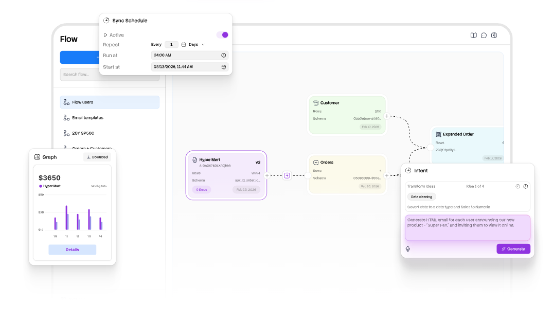
Columns is an AI-driven data visualization and storytelling platform often described as "Canva for data." It connects to spreadsheets, databases, and other data sources, then generates charts, dashboards, and narrative explanations from natural language inputs. Users describe what they want to see, and the tool produces the visualization. The platform has three components: Columns Drive (data catalog management), Columns Flow (data automation), and Columns Graph (visualization builder).
The Problem Columns Solves
Teams working with data face a persistent bottleneck: getting from raw data to a shareable visualization requires either learning specialized BI tools (Tableau, Power BI) or waiting for a data analyst to build reports. Columns removes this bottleneck by letting anyone describe a visualization in plain language and get an immediate result. The target user isn’t a data engineer — it’s a business professional who needs to communicate data insights without writing SQL or configuring complex dashboards.
How It Works
-
Connect your data. Link Columns to spreadsheets (Google Sheets, Excel), databases, or other data sources. The platform plugs into existing data workflows.
-
Describe what you want. Type a natural language query — "Show me sales by region for Q1" or "Compare revenue growth year over year." The AI interprets the request and generates an appropriate visualization. Speech-based queries are also supported.
-
Customize and share. Adjust the chart type, styling, and design elements. Share the resulting data story as a link, embed it in a document, or publish it through Slack and GitHub integrations.
Three Platform Components
Columns Drive. A data catalog management tool. Organize, search, and manage data assets across your organization. Provides a centralized catalog that makes data discoverable and accessible to team members who need it.
Columns Flow. Data automation capabilities. Set up workflows that clean data, transform it, and route it to the right destinations automatically. Reduces manual data preparation work that typically consumes significant analyst time.
Columns Graph. The visualization builder. Create charts, dashboards, and data stories using natural language inputs or the visual editor. Supports multiple chart types with a library of design elements. Described as the primary interface for data storytelling.
Inside the Tool
Natural language querying. Describe what you want to visualize in plain English (or via speech). The AI interprets the request, identifies the relevant data fields, and generates an appropriate chart or visualization. No SQL or formula knowledge required.
Self-serve data storytelling. Build narrative data stories — sequences of visualizations with contextual explanations — without relying on a data team. The platform generates both the charts and the narrative text that explains what the data shows.
Real-time collaboration. Multiple team members can work on data stories and dashboards simultaneously. Fine-grained access controls let administrators manage who can view, edit, or share specific data assets.
Integration with Slack and GitHub. Share visualizations directly in Slack channels or connect data workflows through GitHub. These integrations enable data storytelling within existing team communication and development tools.
Data beautification tools. A library of design elements, templates, and styling options to make visualizations publication-ready. The platform emphasizes visual appeal alongside analytical accuracy.
What It Costs
| Plan | Price | Details |
|---|---|---|
| Basic | $0/month | Free tier for basic access and visualization |
| Premium | $75/year (~$6.25/month) | AI data storytelling features, expanded capabilities |
| Lifetime deal | One-time payment | Available through AppSumo (check current availability) |
The free tier provides enough functionality to evaluate the platform. The Premium plan at $75/year unlocks the full AI storytelling engine. A lifetime deal has been available through AppSumo, offering permanent access for a one-time payment rather than ongoing subscription.
Not Ideal For
The platform is web-only with no desktop application. Users who need offline access or prefer native desktop tools will find the browser-only limitation restrictive. All data processing happens in the cloud, which may concern organizations with strict data residency requirements.
Integration options are limited to Slack and GitHub. Teams using other collaboration platforms (Microsoft Teams, Jira, Confluence, Notion) must share visualizations manually via links or exports. The integration library is narrow compared to established BI tools.
The icon and template library has been reported as limited by users. While the platform includes design elements and chart types, the variety falls short of dedicated design tools. Teams with established brand guidelines may find customization options insufficient for pixel-perfect outputs.
The data management system has been described as unclear by some users. Naming conventions, data cataloging, and version control for data stories aren’t as structured as dedicated data management platforms. Teams with complex data governance requirements should evaluate whether Columns meets their compliance needs.
The platform has a learning curve despite its natural language interface. Understanding how to phrase queries effectively, which chart types work best for different data patterns, and how to structure multi-step data stories requires initial time investment.
Visit Columnsv2 — https://columns.ai/flow